This case study is part of the University of Waikato website redesign and development project. It was a huge project so I’ve split it into multiple case studies including, a project overview and discovery case study and a visual direction and digital style guide case study.
Study options is a key section on the University of Waikato website. It guides students through choosing a degree and subjects and then applying to the university. The University of Waikato offers highly customisable degrees, making the process complicated.
I have chosen this case study because it is the most complicated UX problem I have worked on. It involved many moving parts such as:
University of Waikato
Design Lead (what does this mean?)
Facilitating discovery, UX/UI design
2022-2023
The website launched in April 2024
Silverstripe
Silverstripe delivery team; University of Waikato web team
Through discovery, we identified a large number of pain points in the study options section. These included:

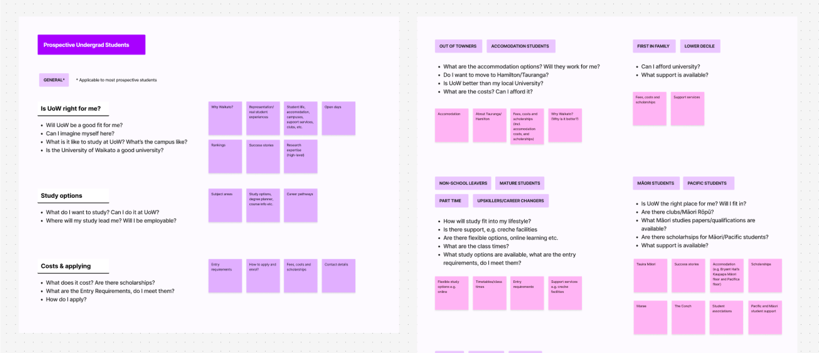
From discovery we identified the audience for this section (for more information about the process read the discovery case study)
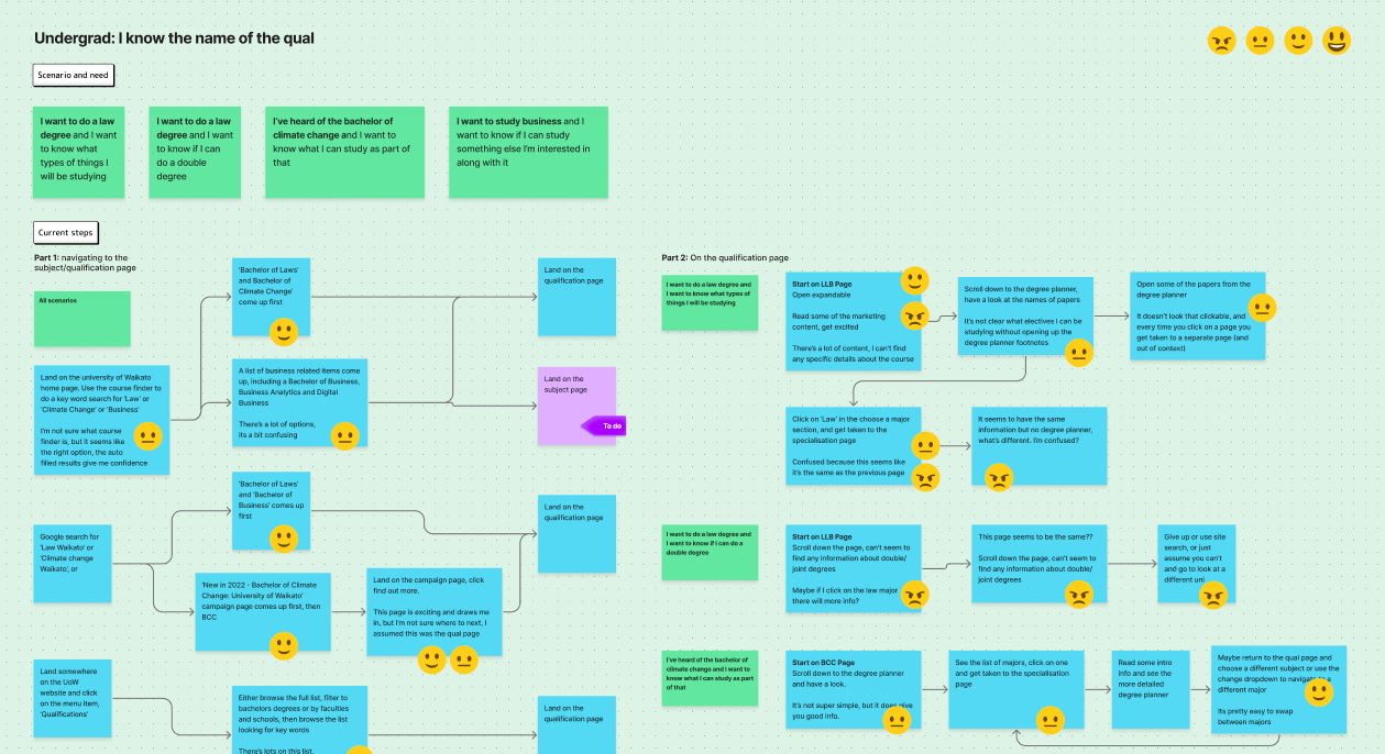
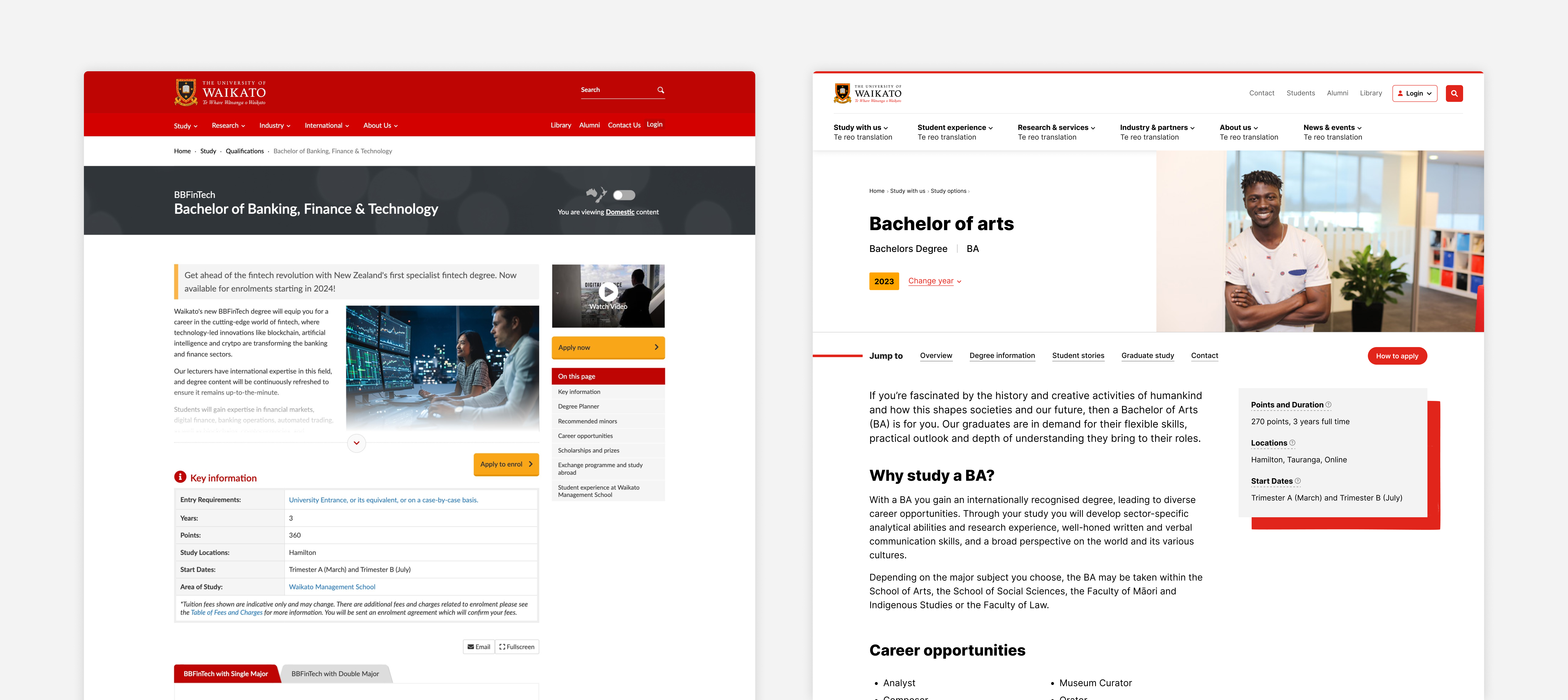
To understand further what was working and wasn’t working, using the old website, I mapped out all the steps a user needed to take to achieve their goal. This was also a helpful way to explain to stakeholders what wasn’t working so they were on board with the changes I proposed later.
My key take-away was that way finding between pages was a big issue, making the process confusing and frustrating.
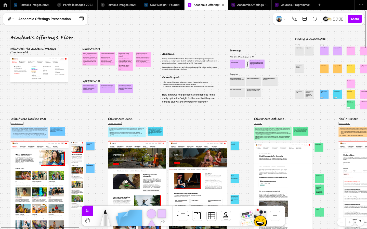
Moving into the design phase I proposed some solutions to the question: How might we help prospective students to find a study option that’s right for them so that they can enrol to study at the University of Waikato?
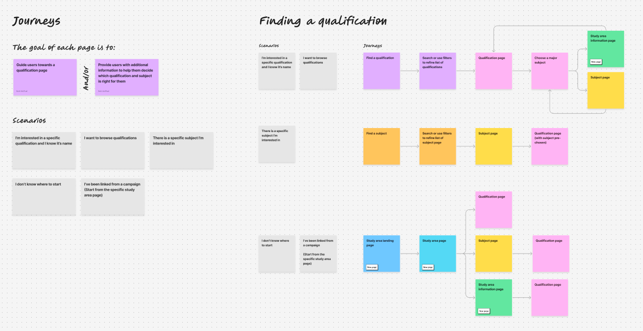
Before I designed any of the page templates, it was important to figure out the flow between pages, and where each piece of information should live. To do this, I needed to create a proposed flow of information. I began by defining the goals (from the universities perspective).
The goal of the section is for a potential student to
The goal of each page is either to
Starting with a series of common scenarios, I mapped out the proposed page flow. Potential students start their journeys in many different ways. They exist on a spectrum from ‘I know what’ I want to ‘I have no idea’.
Spending time creating the proposed user journeys meant that when I was designing the pages, I was able to make sure that it was intuitive to navigate between the pages in the flow.
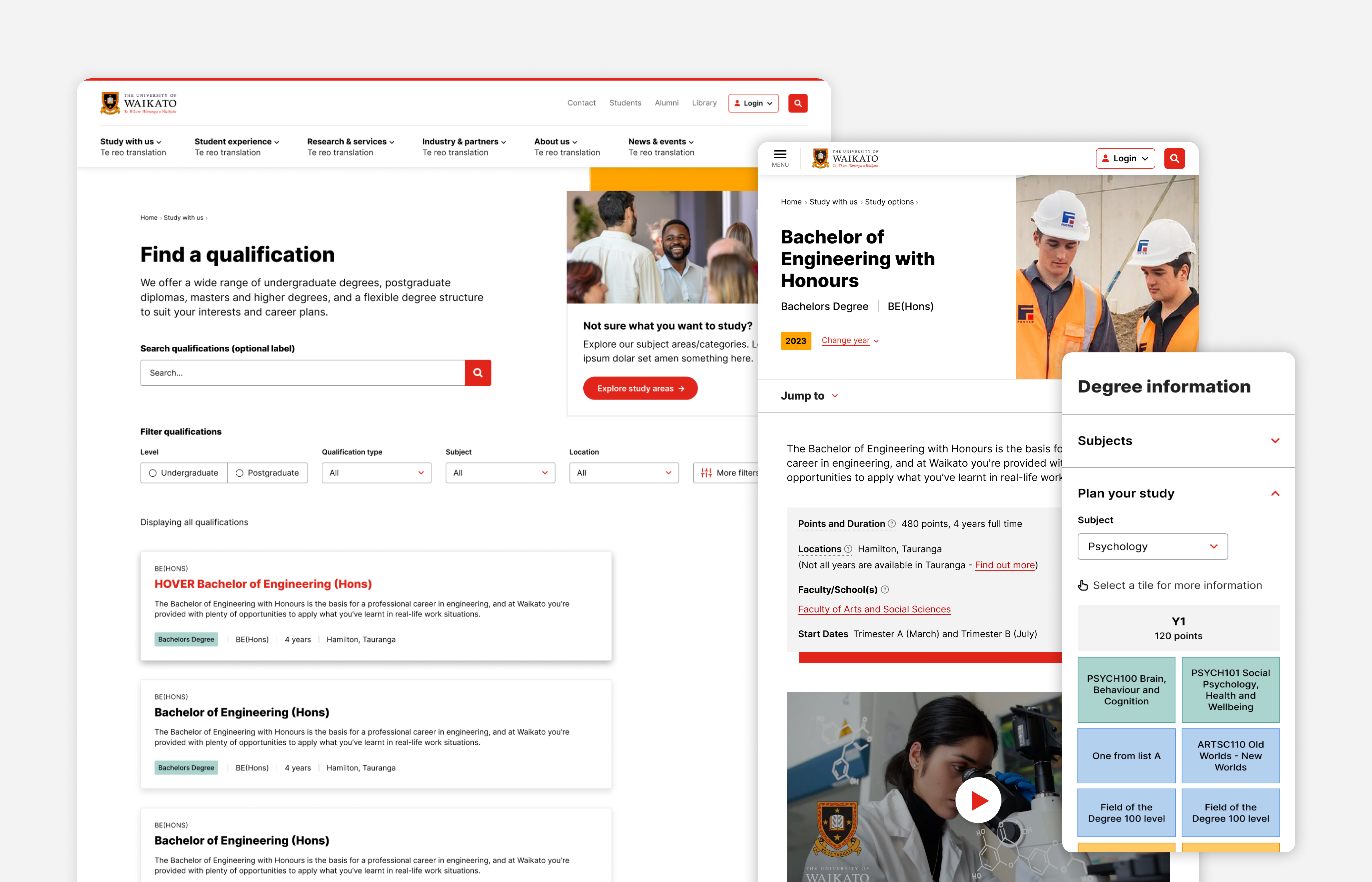
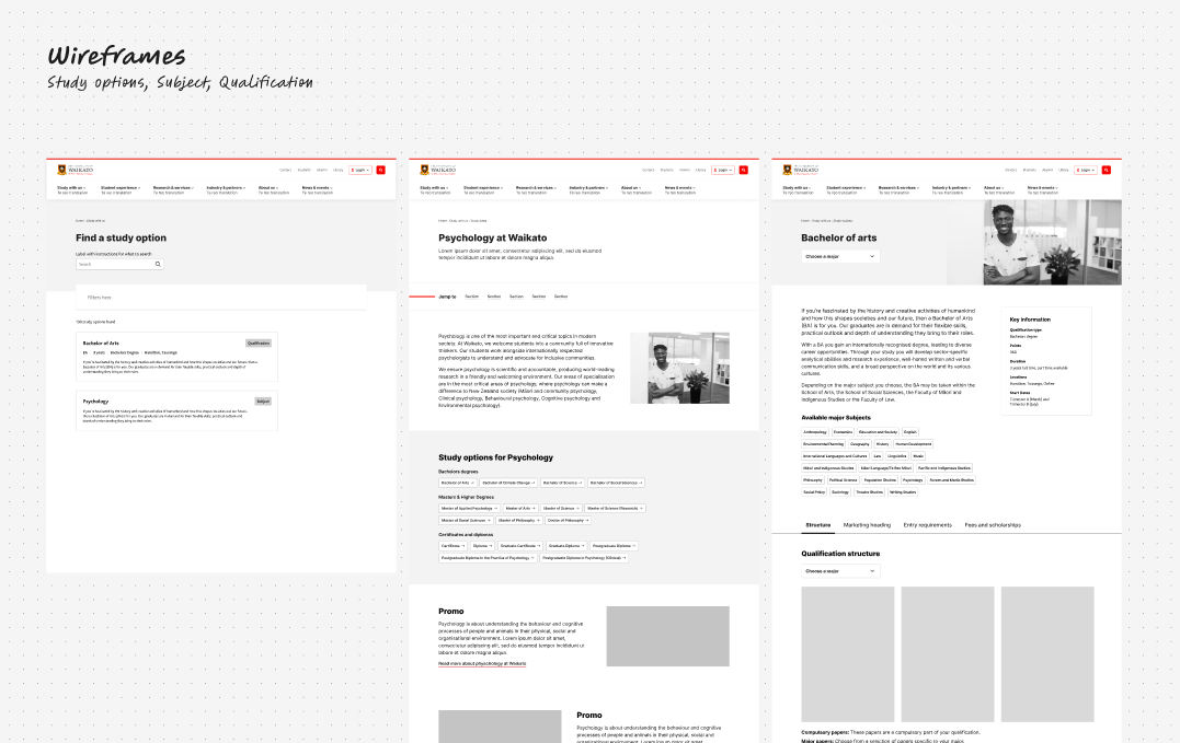
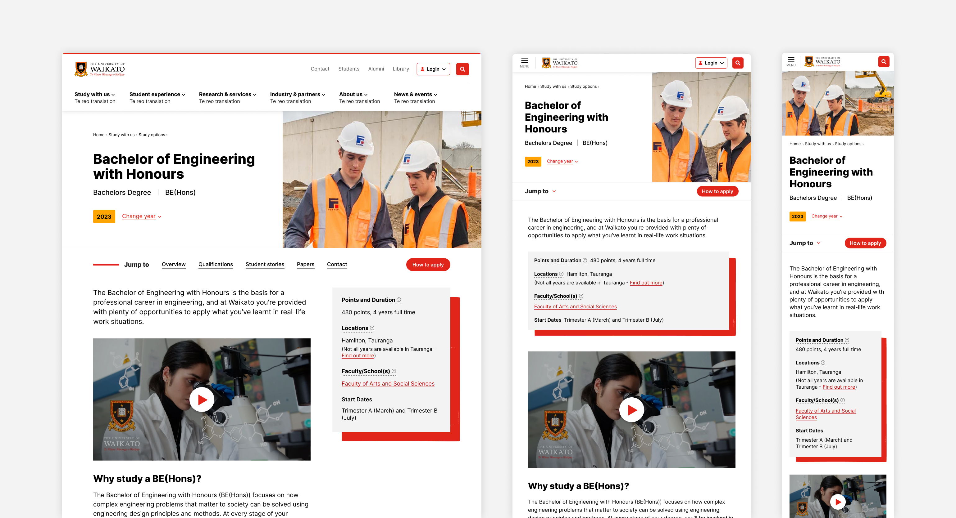
The study options section section consisted of 7 different page templates. The qualification page is arguably the most important page in the section.
The purpose of this page is to be a central hub for all information about the qualification. It should provide access to all information a prospective student might need to make a decision about whether the qualification is right for them. This includes content, way finding and contact information.
I went through an extensive wire framing process. Beginning with very low fidelity wireframes, identifying sections of content, moving onto much more detailed concepts. At each point in the process I presented my work to gather feedback from stakeholders. We also tested the designs with students.
The content from these pages came from different sources including:
This added a layer of complexity to the page design, as I needed to figure out where all the information was coming from, and in what format, as that influenced what I was able to do with the page layout.
Design decisions:
The qualification pages have a lot of content. In some cases, I would recommend creating multiple pages for this volume of content. However in this case, having a single page made way finding much easier. I used other strategies to break up the content and make it more digestible on the page.
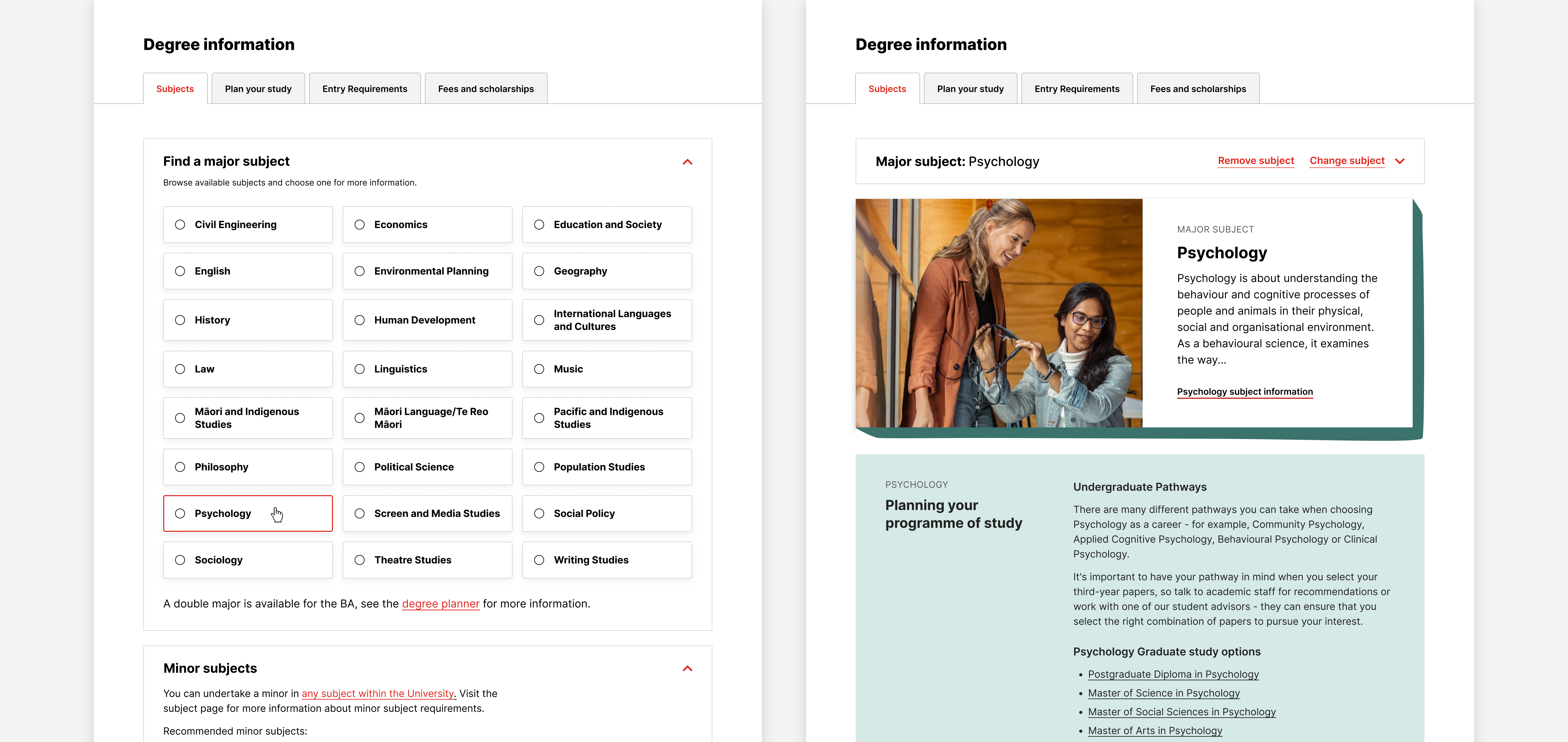
For most qualifications, you can choose a subject to major in, there is additional information specific to the qualification + major combination. Previously there was a separate page for these, however there wasn’t enough information for a new page, and it meant that the information wasn’t in a central location.
Design decisions:
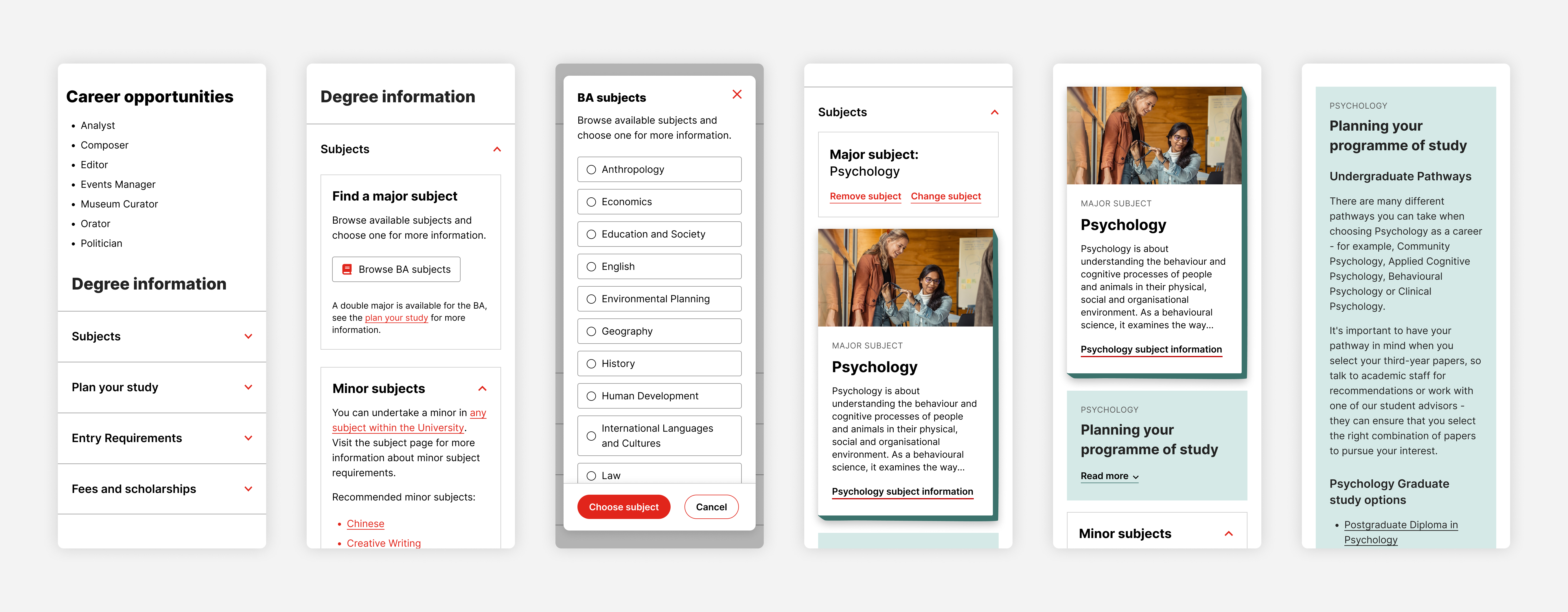
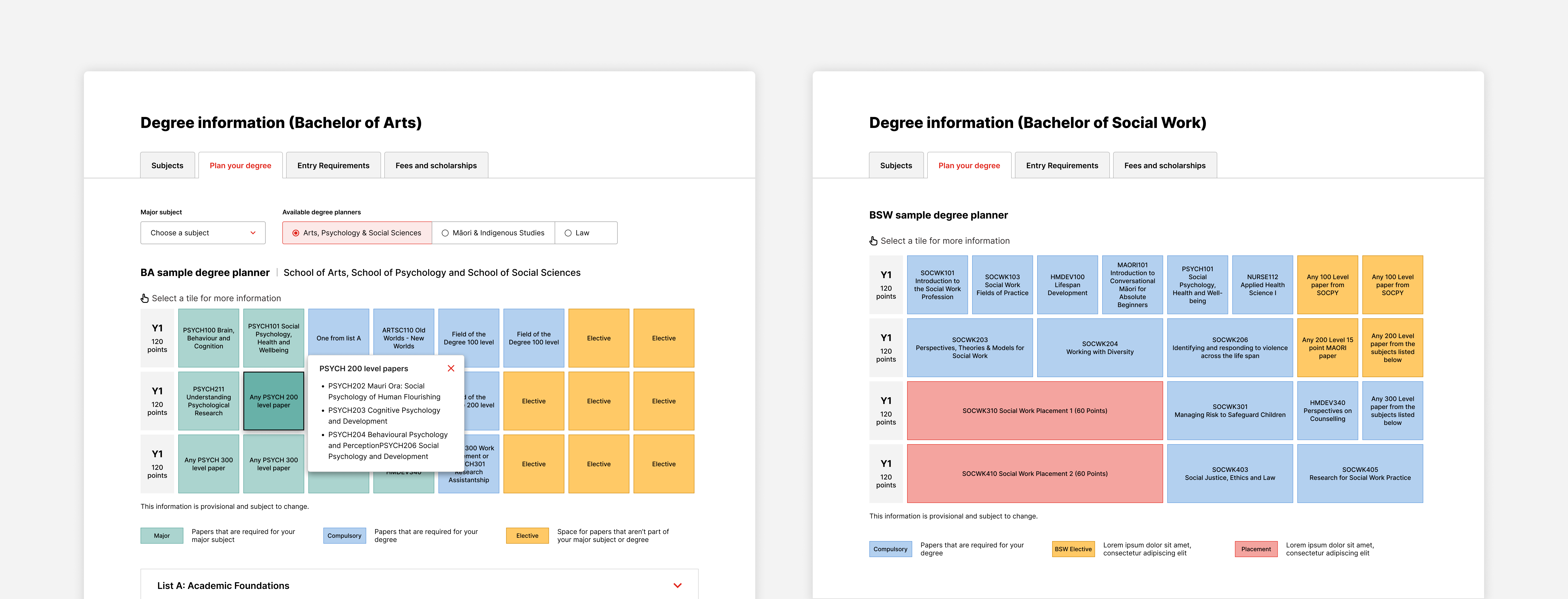
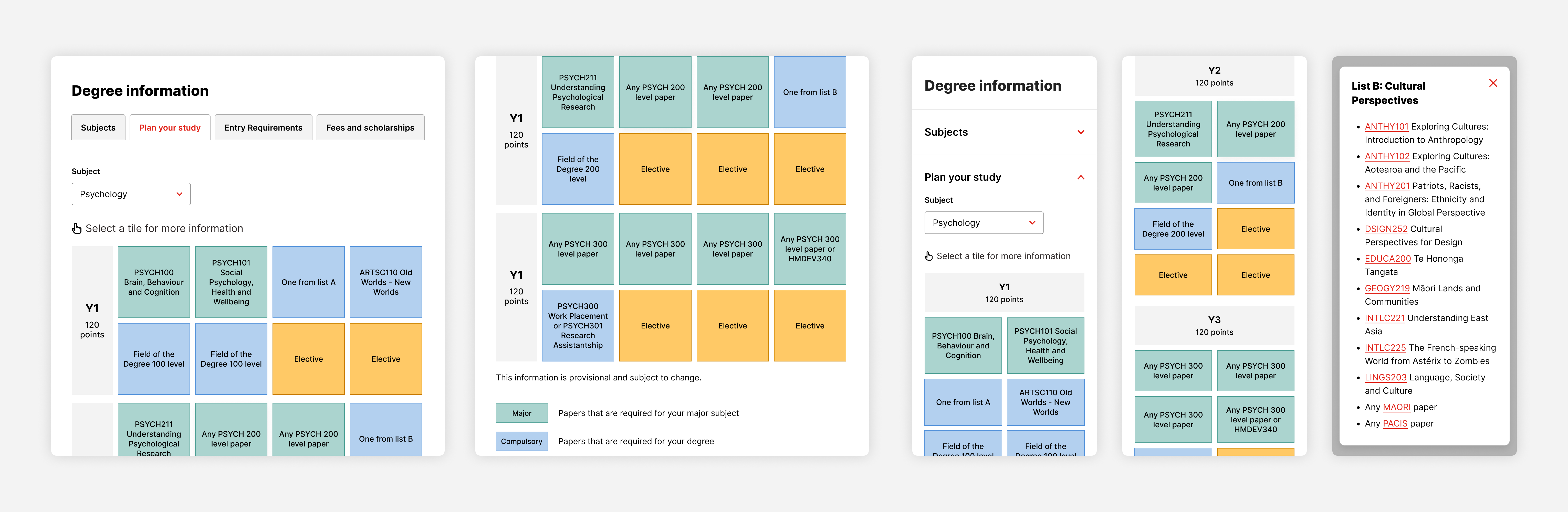
Degree planners are created in a separate system, my job was to create a flexible design to display different degree planners on the website.
Design decisions: