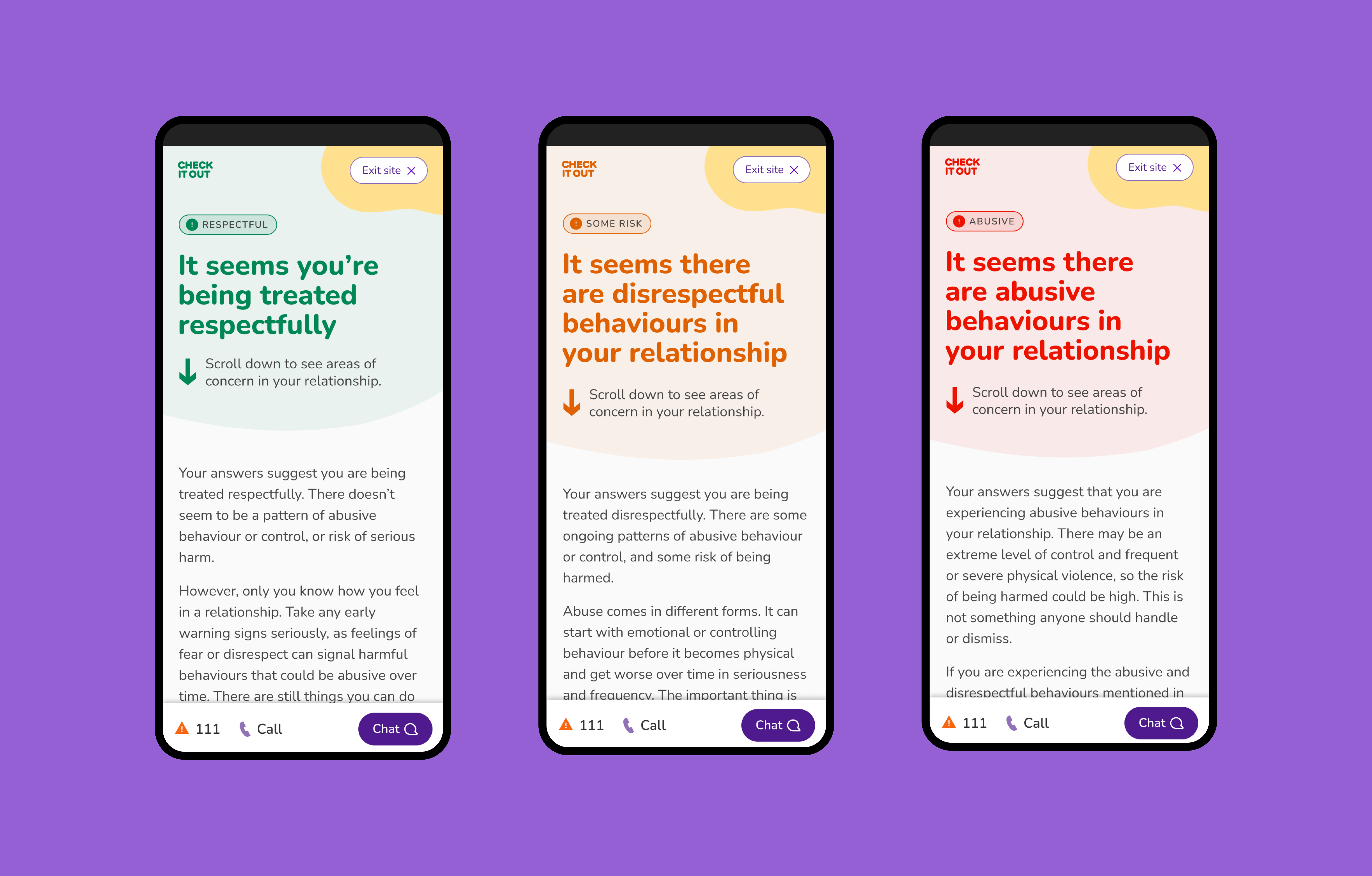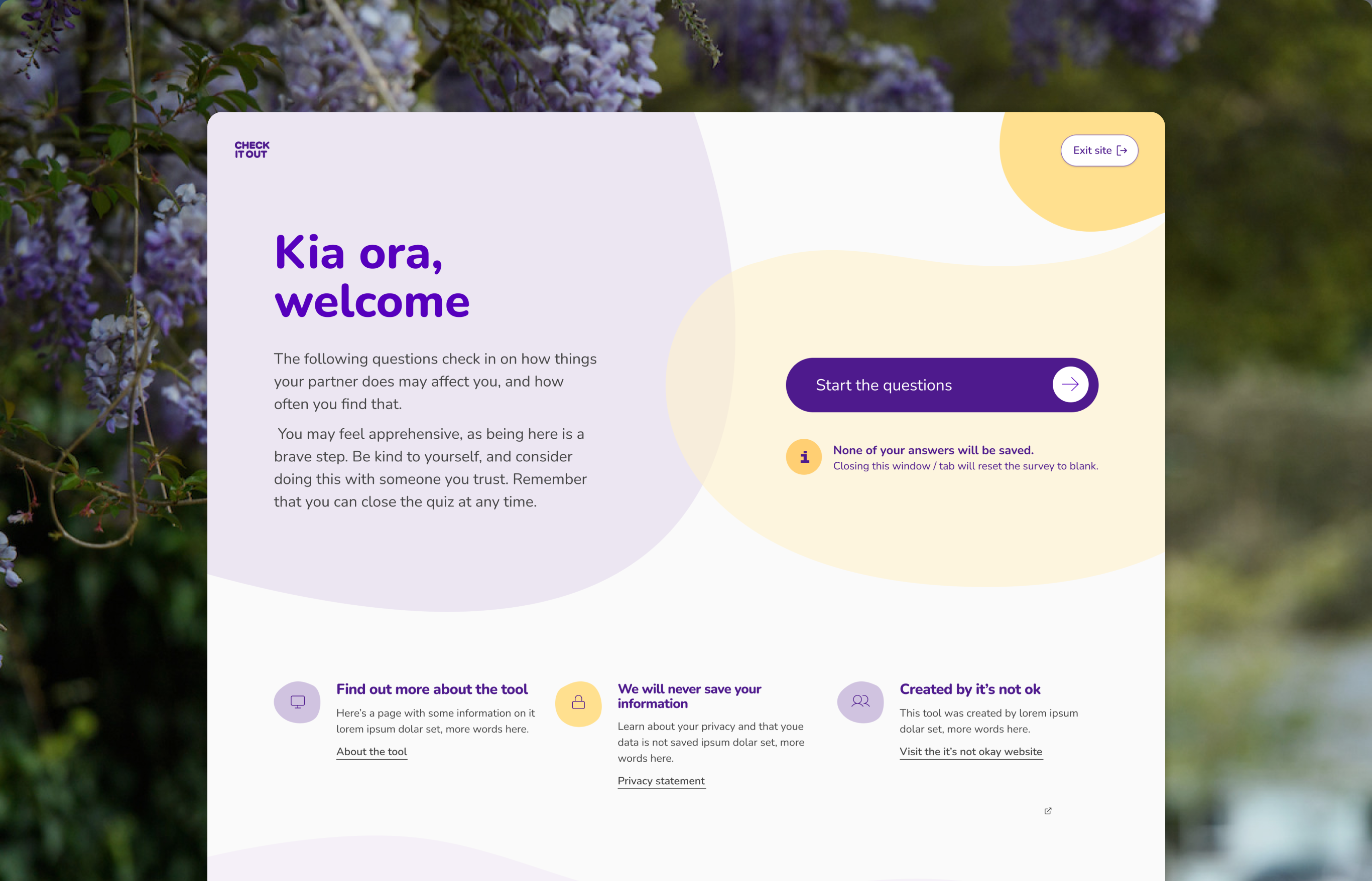
This project was for New Zealand’s Ministry of Social Development. The project had two phases. Phase one was to create a help portal to provide easy-to-access and relevant information for people seeking support for family violence in New Zealand. Phase two was to build a tool that would help people to identify potentially harmful behaviours in their relationship.
This website has been taken over by another agency, whilst the live website looks similar, it no longer reflects the designs in this case study.
Ministry of Social Development
Workshop facilitation and UX/UI Design
I ran the users and journeys workshop for this project and helped out with redesigning the home page and relationship check tool, responding to rounds of user testing
2021-2022
The help portal went live in 2021 and the relationship check tool was launched in 2022.
Silverstripe
Silverstripe delivery team; Ministry for Social Development team, Kantar republic (user research)
‘Are you ok’ and ‘Check it out’, were two of my favourite projects I’ve been involved in. The collaborative approach between MSD, Silverstripe and Kantar Republic meant that we tested often and the impact of this meant that we created a help portal and self-evaluation tool that had a real impact on the people that needed them.
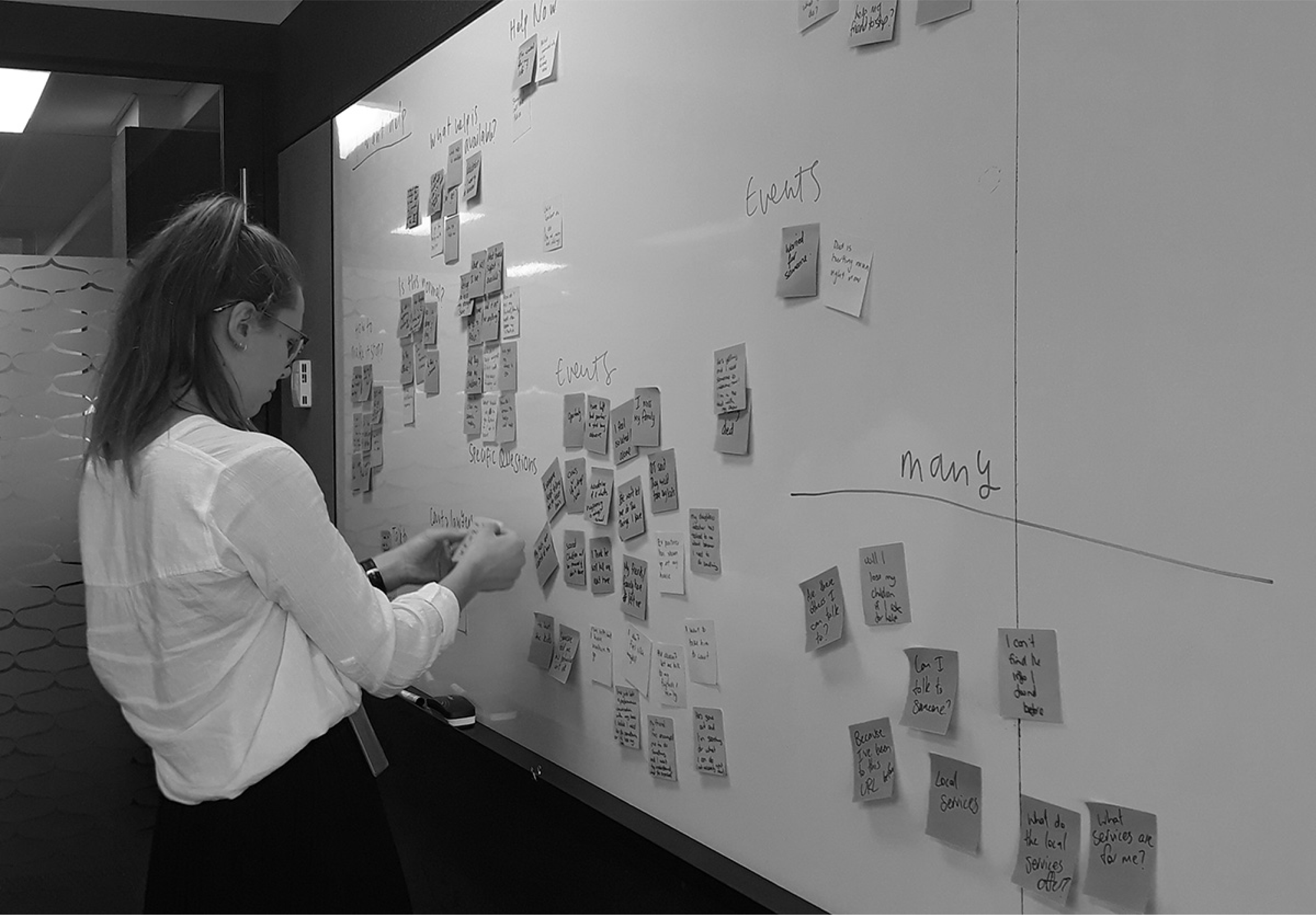
I ran a users workshop with stakeholders as part of discovery. This workshop was all about the people who used the website. Using the knowledge of subject matter experts at Ministry of Social Development (MSD), we identified key user groups, goals, journeys plus external factors and barriers to accessing the service.
The primary audience for the first launch of this website was women who were experiencing domestic violence. There are future plans to make the website more inclusive of LGBTIA+ and male audiences too.
We worked iteratively on the help portal. The first version of the site went live and overall the feedback was positive.The website had intentionally been designed with minimal imagery and a muted colour palette to not overwhelm people or make the website easily recognisable for people in potentially dangerous situations. We received feedback that whilst the site was functional, it could be more visually engaging, so the focus of phase two was to update the visual design. This included colour, tone and imagery.
How might we use colour, imagery and content to create a web experience that creates and environment that supports people while they access the help they need?
We created a series of options, some with brighter colours, and others with a calmer colour palette. Two of the options included illustration and two had photography. We hypothesised that the illustrations would feel more inclusive because they weren’t of specific people.
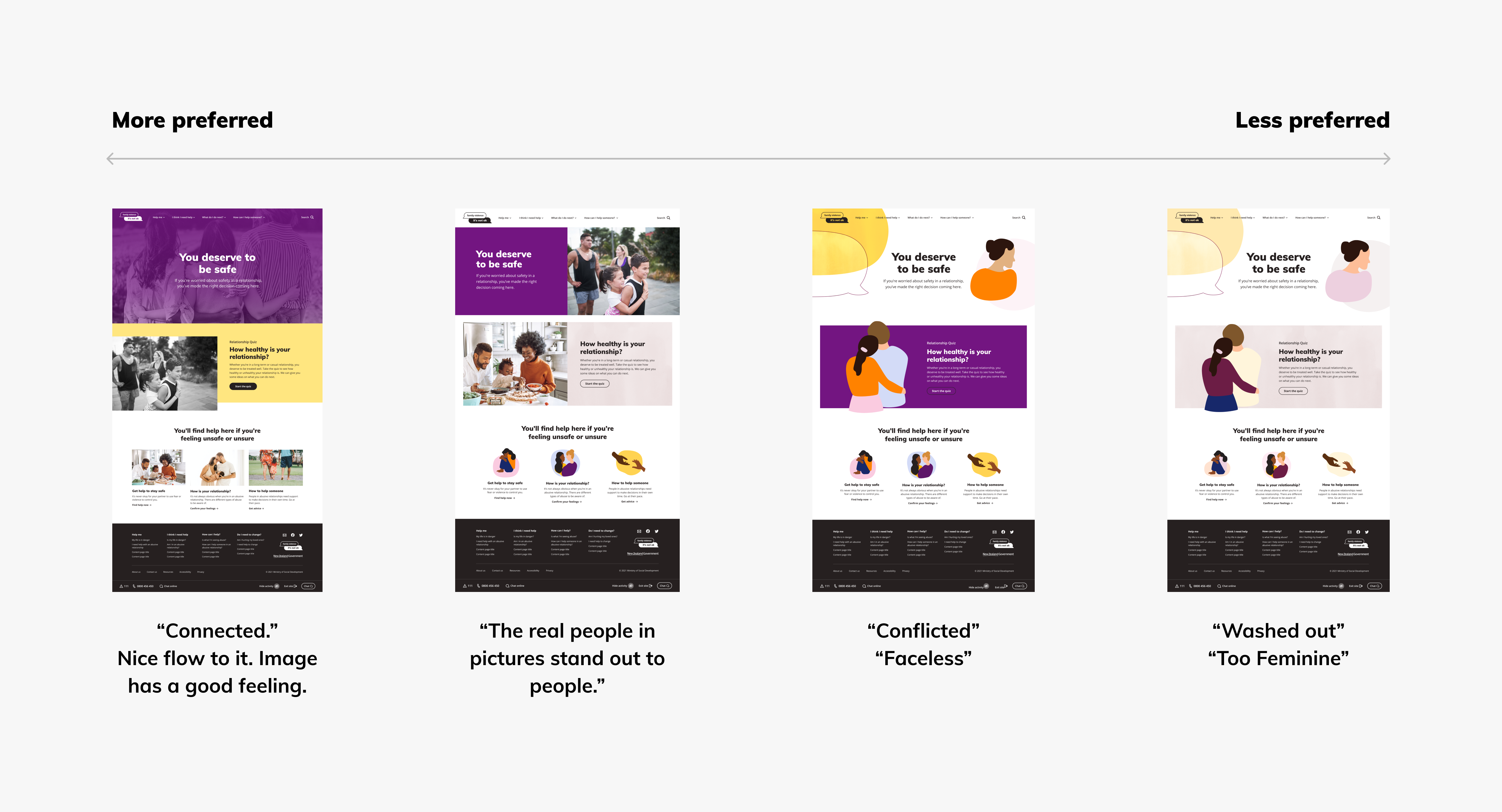
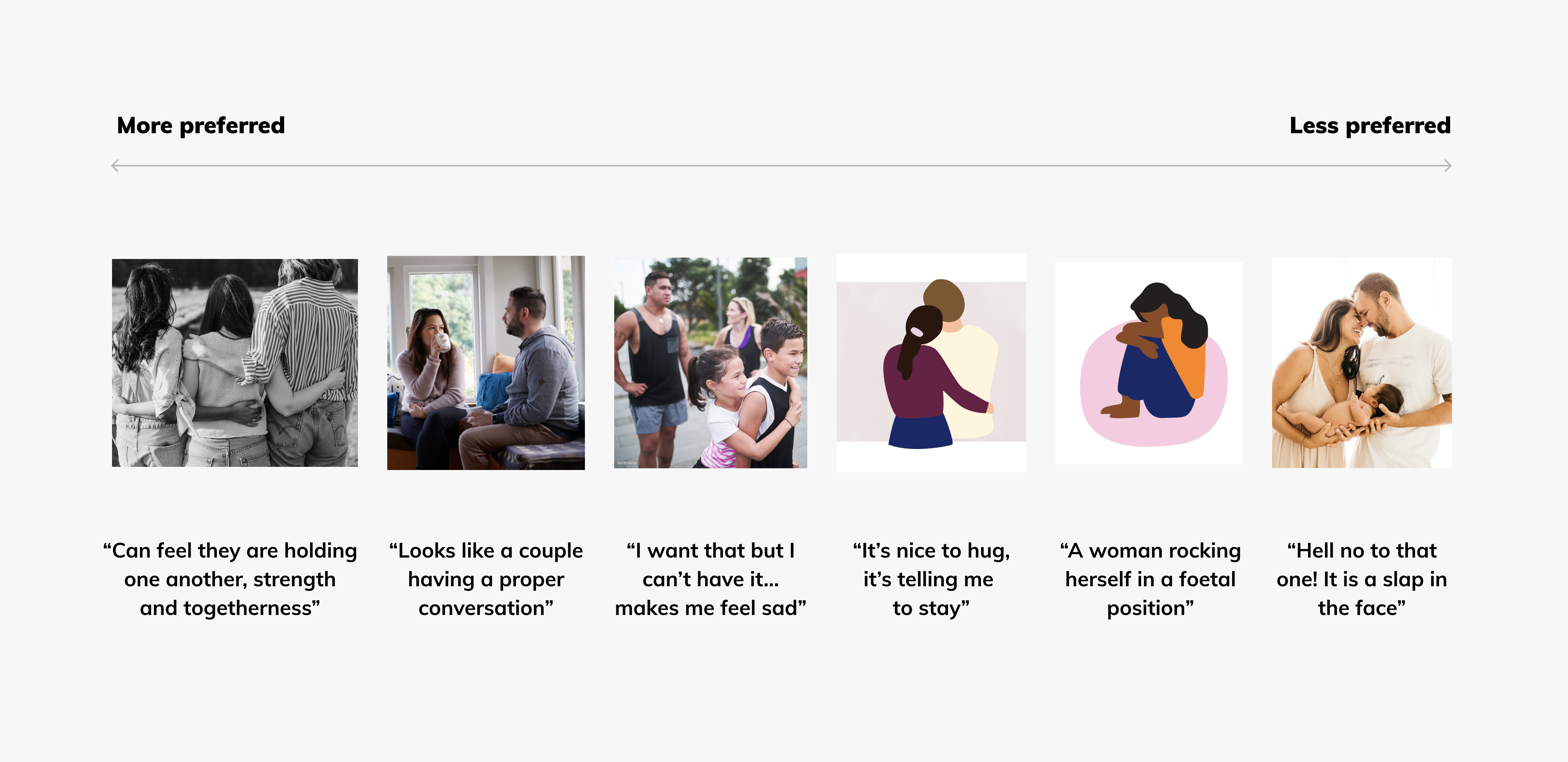
As a team of people who did not have lived experience, we did not predict the outcomes of the testing. We had favourite designs but once we got the responses it was easy to let those go in favour of the direction that most resonated with people.
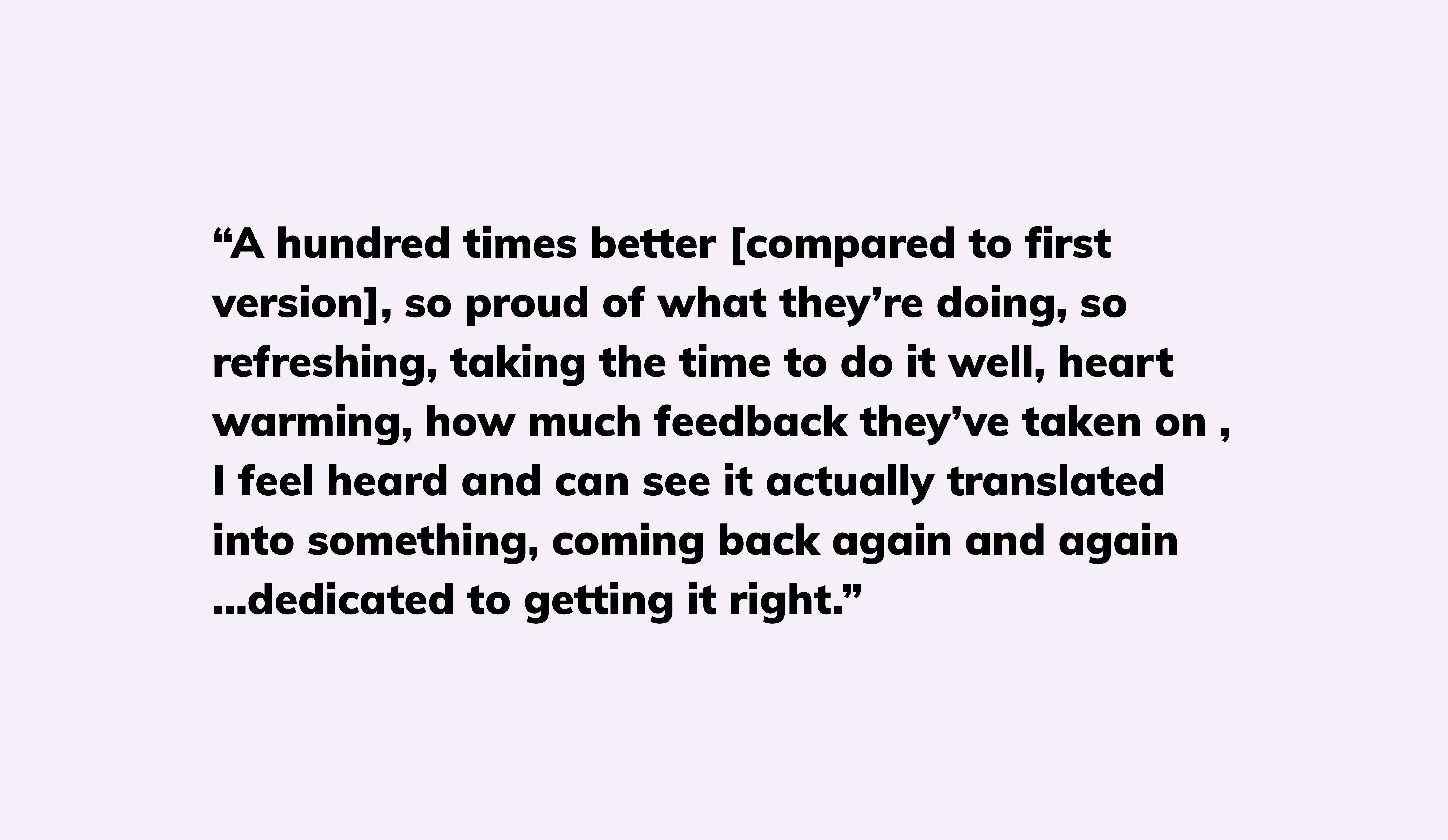
The revised portal received a positive response, particularly from women, Māori and those who have been close to domestic violence. The look and feel of the new site is positive and welcoming. It is strongly preferred over the old site.
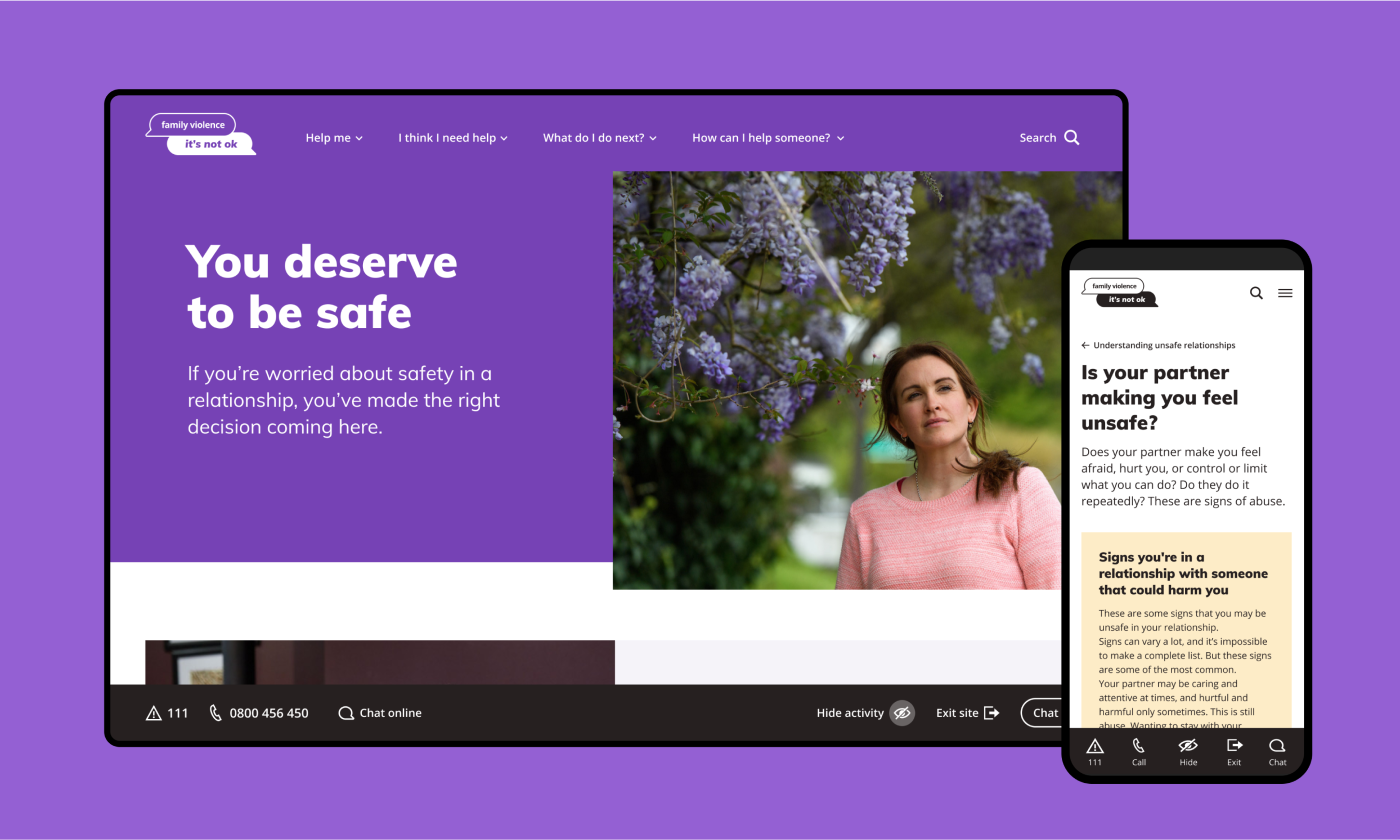
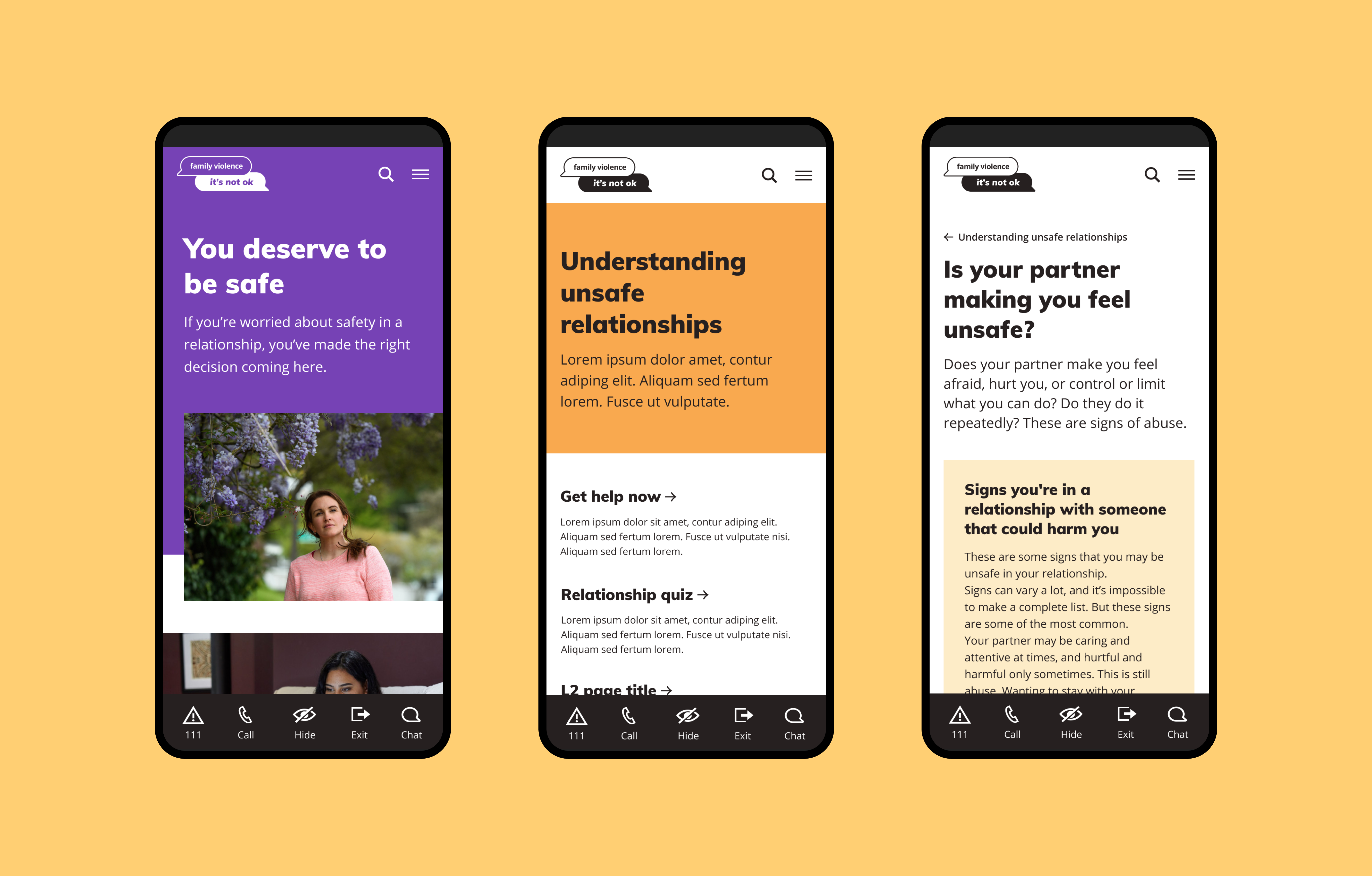
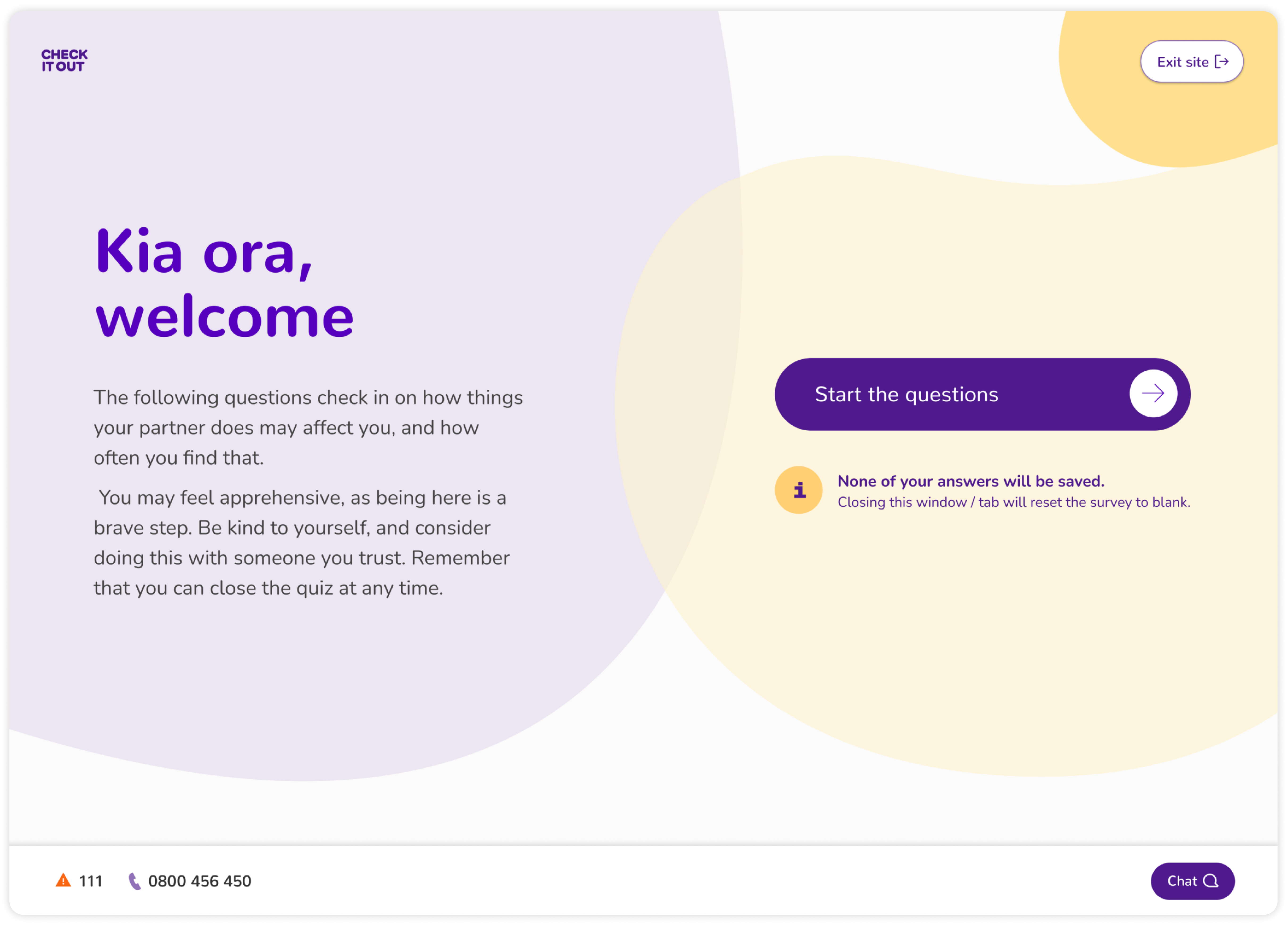
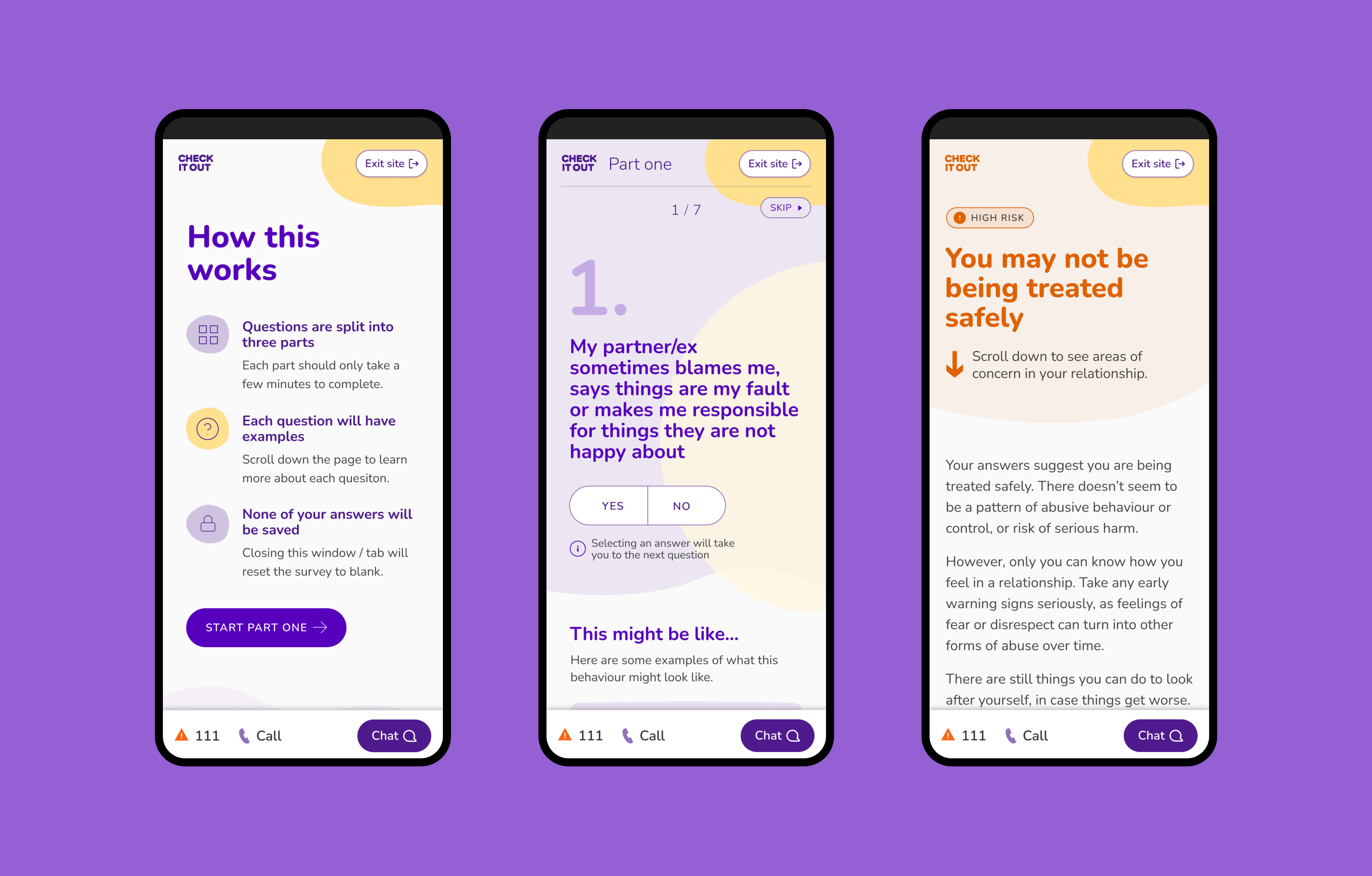
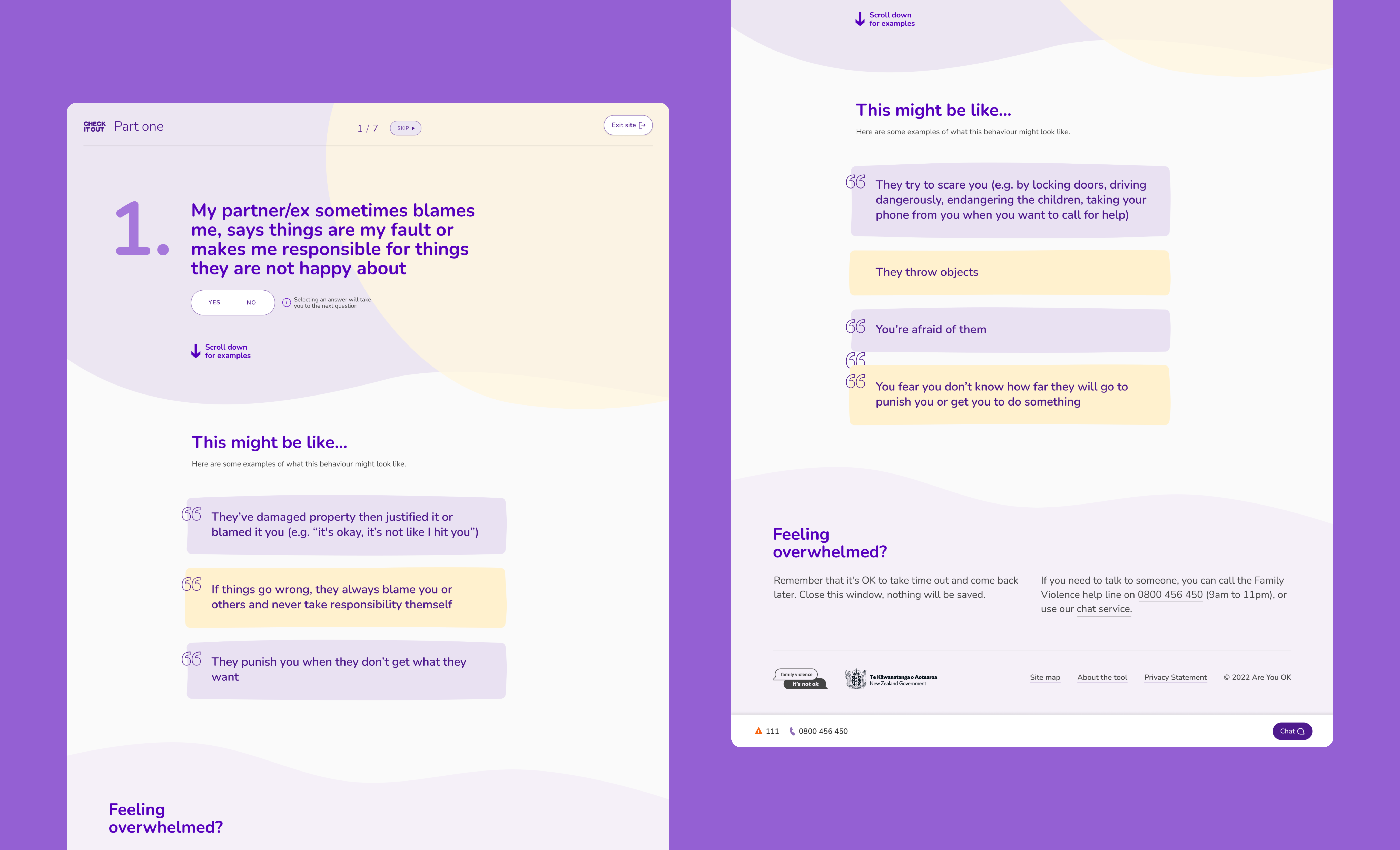
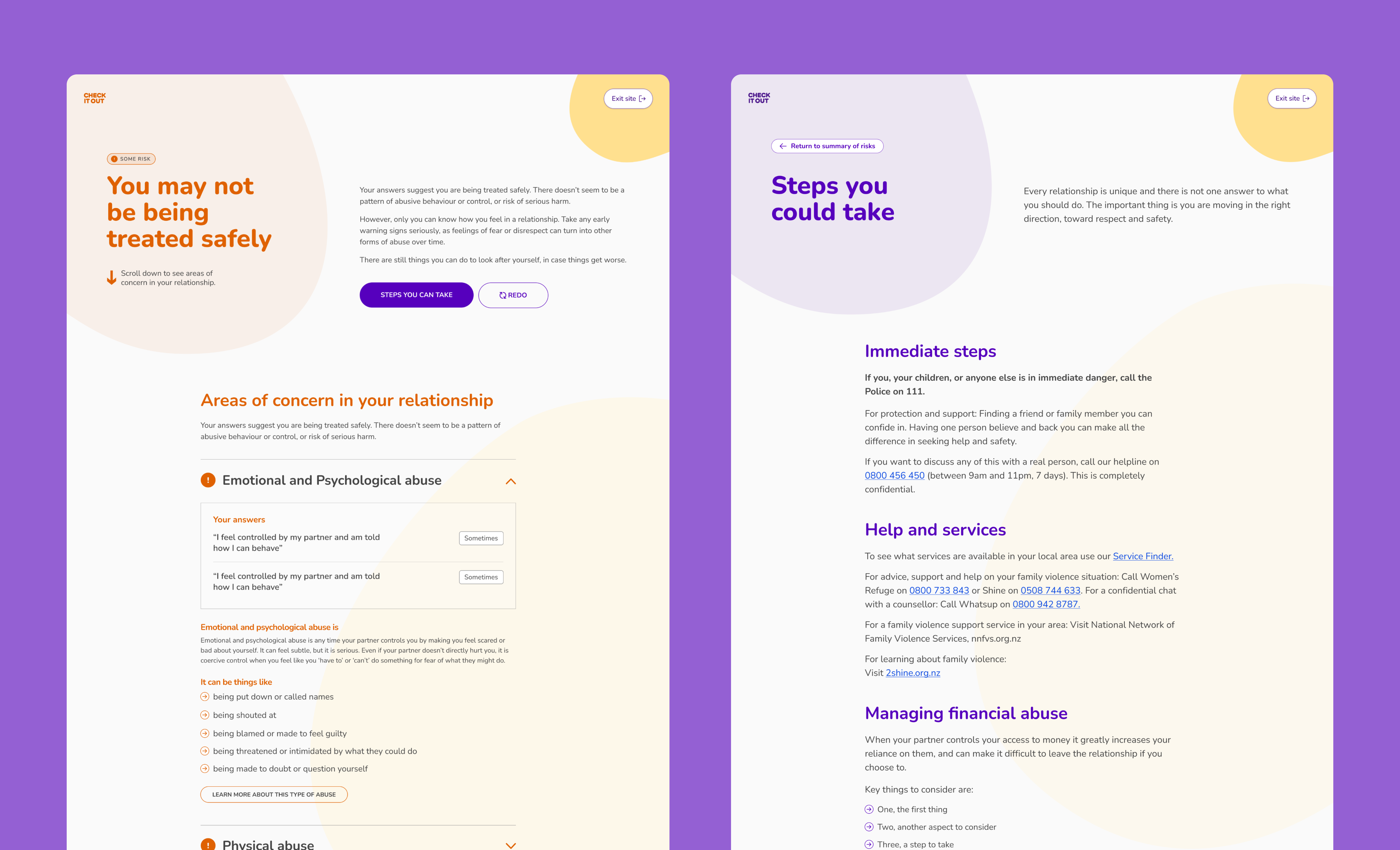
The next phase of this project was to develop a tool to help users gain insight into the types of potentially harmful behaviours in their relationships. After inheriting this project from another agency, my role was to rethink the UX/UI design, improve the accessibility of the UI and extend the design across different breakpoints.
This tool is designed for people who are feeling concerned about behaviours that they are experiencing within their relationship. The goals of the tool were: